

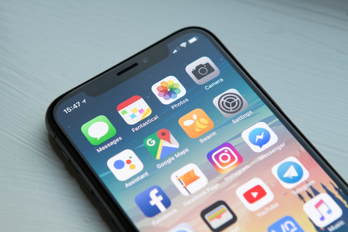
1. The Biomechanics of Handheld Mobile Devices
Over 70% of global web traffic originates on mobile devices. Yet many desktop-first websites simply shrink down layouts without adapting to the physical realities of single-handed smartphone usage.
2. The Ergonomic 'Natural Thumb Zone'
When holding a mobile device with one hand, the bottom third of the screen is the easiest to reach comfortably without adjusting hand grip. Modern mobile UX structures prioritize:
- Bottom Action Bars: Moving primary navigation tabs and checkout buttons within thumb reach.
- Minimum 48x48px Touch Targets: Providing ample interactive padding to prevent accidental mis-taps on closely spaced links.
- Swipeable Drawers (Bottom Sheets): Replacing centered desktop popups with native-feeling bottom sheets that users can drag to dismiss.
3. Gesture Feedback and Touch Responsiveness
Utilize subtle CSS touch-manipulation properties and smooth spring animations to make touch gestures feel responsive and physically grounded.